C'mon already! I'm a huge Ra's al Ghul fan - he's actually my Bat favorite villian - but I'm sick of dead comic book characters coming back to life. I hit the wall (no pun intended) with Jason Todd's resurrection and now shit like this annoys me to no end.
http://www.midtowncomics.com/eshop/pop_p...&InCart=0&adv=2 Product Title:
Batman #670 Regular Tony Daniel Cover (Resurrection Of Ras Al Ghul Prelude)

Our Price:
$2.54
Add to Bag
Tell a Friend
Subscribe
Release Date:
10/31/2007
Manufacturer / Publisher:
DC
Writer:
Grant Morrison
Artist:
Tony Daniel
Description:
"The next chapter of Batman’s life starts here! The shadow of Batman’s archfoe Ra’s al Ghul still looms large over the head of the Dark Knight. Is Ra’s al Ghul destined to live again? Batman begins his quest for the truth in this special prelude to “The Resurrection of Ra’s Al Ghul,” guest-starring Talia al Ghul, Damian, the Sensei and I-Ching!"
Well, to be fair, Ra's has ALWAYS come back from the dead.
yeah, pretty much been expecting this since they "killed" him. nice cover, though.
Well, to be fair, Ra's has ALWAYS come back from the dead.
aye.
he's one of the few guys i dont mind this stigma for. its his gimmick.
plus, he's the coolest baddie of all time.
Well, to be fair, Ra's has ALWAYS come back from the dead.
aye.
he's one of the few guys i dont mind this stigma for. its his gimmick.
plus, he's the coolest baddie of all time.
I agree with you on that last point - he is the only Batvillian who I think is as smart - if not smarter - than Batman and I love him for that. And, yes, the whole resurrection thing is his shtick, but the whole
Death and the Maidens thing (which I hated as Talia, once again, proved to be too easily manipulated and the intro of a heretofor unknown "daughter" pissed me off) indicated that this was the
absolute "final" death of Ra's. It just seems to me that the whole bringing back a character from the dead diminishes that hell out of their death in the first place.
My only hope is that Morrison is writing it and he will do the "resurrection" justice. I used to have absolute faith in Morrison, but the dull ASS has shaken that faith a bit...
i believe its morrison and dini -- two of the greatest batman authors, evar
and he hearts you, harley.
Indeed.
but not as much as he hearts zatanna. seriously, his wife is a stage magician who looks just like her. . .
Sugar, I
know! Part of the reason I "heart" him so much...
but not as much as he hearts zatanna. seriously, his wife is a stage magician who looks just like her. . .
I thought that was Alex Ross?
A comic book character coming back from the dead!
I can't believe it!
What's next? A big EPIC crossover designed to screw the 8 people left that still buy comic books?!?
but not as much as he hearts zatanna. seriously, his wife is a stage magician who looks just like her. . .
I thought that was Alex Ross?
nope.
A comic book character coming back from the dead!
I can't believe it!
What's next? A big EPIC crossover designed to screw the 8 people left that still buy comic books?!?
Which is why this fucking annoys me!
but not as much as he hearts zatanna. seriously, his wife is a stage magician who looks just like her. . .
I thought that was Alex Ross?
nope.
Are you sure? I'm almost positive that Ross has said he based his Zatanna on his wife...
but not as much as he hearts zatanna. seriously, his wife is a stage magician who looks just like her. . .
I thought that was Alex Ross?
nope.
Are you sure?
yep. she was at D*Con with him last year. his new Madam Mirage book is also based on her.
his new Madam Mirage book is also based on her.
which i am enjoying so far...
eh...the book. not the wife...
cool so far. ive only grabed the first two issues(not sure if theres more) a few days ago. I like the art, though thats just my opinion ;). And i always like stories about bad guys going "legit"...
I've noticed how Batman has gone back to the blue & grey, instead of the black & grey.
DC Comics: One Step Forward, Twelve Steps Backward...
the kubert / morrison run has taken the suit back about 25 years. its much terrible.
Batman looks best in black and grey.
I, too, love the art.

Ra's's's return was also teased in the all villian teaser image.
Re: The blue and grey suit. The fact of the matter is that it's easier for a lazy artist to draw the suit in blue and gray. That's why the cape and cowl turned from black to blue in the 40s and why it's happening again now.
Re: The blue and grey suit. The fact of the matter is that it's easier for a lazy artist to draw the suit in blue and gray. That's why the cape and cowl turned from black to blue in the 40s and why it's happening again now.
i don't get how its easier?
the "blue" came about in the 40s because it was easier on the printers. "2 colors to choose from? blue cape, red cape, blue cape, red cape.... let's pick blue!"
i get that. i'm fine with that. if your midnight sky is the same color as a baby boy's blanket, whatever. at least its consistant.
but now a days, there are countless characters with black, yes actual black, coloring in their costume. nightwing, hourman, black panther, robin and... well, even batman on occasion. the coloring is certainly possible. and, underwear argument's aside, i don't see how blue/gray has any pro's or cons versus black/gray, from the reader's viewpoint or the artist's
actually, for the pencil artist, black is easier because they can just leave empty space.
the inker fills in all the black spaces, so if it's going to be easier on anyone to do another color, it would be them.
But a penciller is supposed to take the inking and coloring into consideration when he draws the pages. By pencilling for a blue cape the penciller is more easily able to insure that the composition of the final product will still "work," especially with a character who normally appears at night. The blue cape stands out from the background better. Also, a lot of pencillers don't draw in the details of the cape, leaving that to the inker. That's an incentive for the inker to also leave the cape "blue."
I don't understand why blue would be easier than black for the cape. If anything, wouldn't having it in black cover up any potential mistakes?
I don't know what you said, but I'm sure it's something along the lines of "but ALL pencilers everywhere should draw ALL details ALL the time" or some such nonsense and "blue IS the easiest!" or somesuch.
have you ever actually participated in the production of a comic book? have you ever talked with real artists about art and their techniques and various ways of getting things done (I would say "done on schedule" but all artists are terrible at making deadlines). because I have done these things.
the reality of the situation is that not all artists work the same, pencilers or inkers. in a book not of their owning, the artist will rarely have ensurement of the final product for a number of reasons not the least of which being who inks the work and what level of detailing the inker decides to focus on.
just as a for instance, I remember seeing penciled pages by Steven Butler when he was doing Web of Spider-Man during all that clone business nonsense. the level of detail that Steven used to put into his pages was great and the work he was putting out was capable of making him a big name in the industry.
but he had a poor inker, who did a hack job leaving out a multitude of the details and bringing down the quality of the art overall. basically making Steve's work look like ass.
it's just one example of countless in an industry in which there are multiple forms and styles of doing the work.
Mike Gustovich is actually somewhat renowned inside the industry as an inker who fills in a lot of details over pencilers who do half assed layouts, actually doing a majority of the work himself.
none of which changes the fact that for most pencilers, black is easier as all they have to do is leave an X (or Xs) for the inker to fill in later.
But a penciller is supposed to take the inking and coloring into consideration when he draws the pages. By pencilling for a blue cape the penciller is more easily able to insure that the composition of the final product will still "work," especially with a character who normally appears at night. The blue cape stands out from the background better. Also, a lot of pencillers don't draw in the details of the cape, leaving that to the inker. That's an incentive for the inker to also leave the cape "blue."
This says to me "G-Man doesn't draw." Some pencilers (from interviews I've read) just draw gestures. Others put in every hair on a guy's knuckles. There's even a 'Tec (or Batman) from around the Knightfall series with an example of pencils and two different inked versions, by two very different guys. Very educational.
P.S. -- Batman is SUPPOSED to blend in with the shadows, with the night sky. Standing out is something he leaves for Robin. [re: "The blue cape stands out from the background better."]
And, having a black cape, boots, and gloves makes Batman look like what he is:
A creature of the night.
And it shows off Robin's DNA better...

I don't know what you said, but I'm sure it's something along the lines of "but ALL pencilers everywhere should draw ALL details ALL the time" or some such nonsense and "blue IS the easiest!" or somesuch.
No, not really. I admit I wasn't as clear as I could have been.
What I was saying was that someone, either the penciller or inker (depending on the art team) had to decide how to portray the shading on Batman's cape and figure out how to make it stand out to the reader from the (typically dark) background.
There are two ways to do this. The preferable way (IMHO) from an artistic standpoint is to take the time to design and render the panel so that the artwork allows you to place Batman in a nighttime setting but still render the cape in primarily black. That can be more challenging, however. The page has to be composed so that, for example, you don't have the black cape blending into the black sky, or the shadows in the batcave or any of the dozens of other night scenes that make up the setting of a typical Batman comic book.
The other way is to do what comic book artists (pencillers and/or inkers) have done for decades with "black" objects in comic books: leave out most of the black and have the colorist color it blue. The blue stands out better to the reader from the dark background better, making it easier to compose the panel.
i get what you're saying, g-man.
the "blue stands out better" theory might be applicable to the laziest of extremely lazy artists, as two similarly black colors may present themselves inseparable to the reader's eye. but even in today's "he's teh lAzIEsT aRTisT evar!!1!" internet critic viewpoint, that at best encapsulates only half of the artistic population.
and, even more damning to that theory, there is no legal binding stating that the "blue" has to be the cape. artists of that laze-factor could simply feature a black cape in the foreground, with a simplistic blue sky, or brick red building filling the background.
plus, even above and beyond all that, it would almost never be a black cape in front of a black sky or alley. rather, it would be a dark gray cape in front of a dark blue sky -- even in a pallette of 64 crayola colors, there is enough contrast. though, in the wolrd of digital computer coloring that we so readily embrace today in our comics, this would ideally be portrayed as a deep charcoal gray cape, illuminated with the ambient glow of a green neon light in front of a rolling, cloudy, crimson sky.
Does DK know?

And I thought you rolled the OTHER way, Oosh...

And, having a black cape, boots, and gloves makes Batman look like what he is:
A creature of the night.
Actually that makes him sound vaguely like Paddington Bear working in the garden.
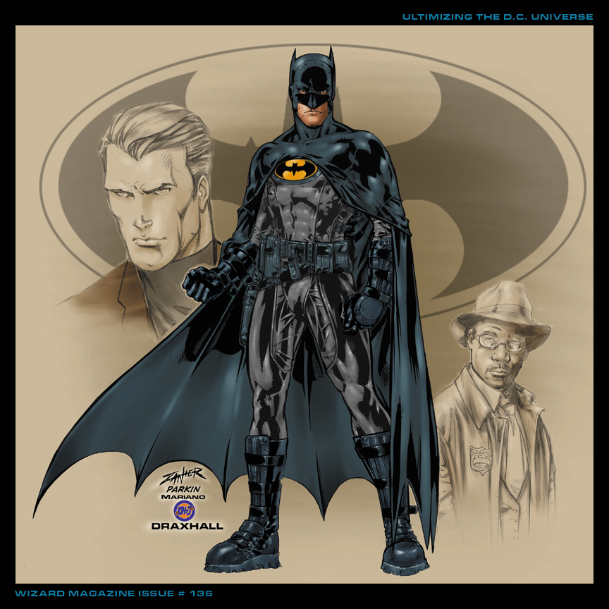
The best version of Batman's costume is still Midnighter's, although this one is still good too:
Batman 670 was pretty depressing.
In the latest we learn that The Sensei is Ra's Al Ghul's father!
SPOILERS!