That scarecrow design if friggin' awesome. Especially like the fear gas sequences.
I was kinda split on the Scarecrow design at first as to whether it was good or not, but the more I saw it, the more I loved it and thought that he should have always looked like that.
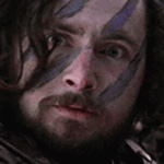
The gas mask in the mask was a nice touch, but it's the fucking syringes on the fingers that make it bad ass.
I think thats why I think I was split on it initially, then realised how cool it was. At first I thought it just didnt sit right, but the more I saw it and compared it to the comic book version, the more gay the comic book version looked.
The mask is fucking awesome, but the needle fingers kind of push him into Freddy Krueger territory.
scarecrow has always been shit. only the most recent BTAS look, where they introduced the true "hanged corpse" style, did he have the opportunity to look cool. undertakerish, even.
the games version is beautiful in its own right. the design resembles the BTAS world, but takes a few more logical leaps -- having a gas mask (which is a purdy scary look) makes sense to combat his own toxins, and the krueger-like "claws" as needles again makes sense, playing up the "broken scientist" mentality of the character.