I don't know what you said, but I'm sure it's something along the lines of "but ALL pencilers everywhere should draw ALL details ALL the time" or some such nonsense and "blue IS the easiest!" or somesuch.
No, not really. I admit I wasn't as clear as I could have been.
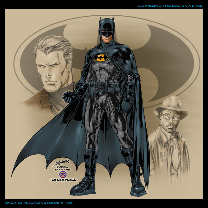
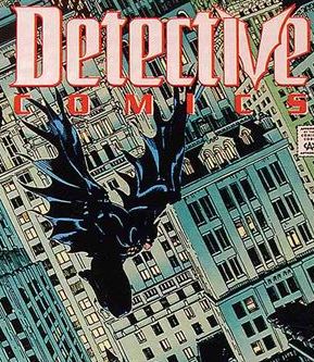
What I was saying was that someone, either the penciller or inker (depending on the art team) had to decide how to portray the shading on Batman's cape and figure out how to make it stand out to the reader from the (typically dark) background.
There are two ways to do this. The preferable way (IMHO) from an artistic standpoint is to take the time to design and render the panel so that the artwork allows you to place Batman in a nighttime setting but still render the cape in primarily black. That can be more challenging, however. The page has to be composed so that, for example, you don't have the black cape blending into the black sky, or the shadows in the batcave or any of the dozens of other night scenes that make up the setting of a typical Batman comic book.
The other way is to do what comic book artists (pencillers and/or inkers) have done for decades with "black" objects in comic books: leave out most of the black and have the colorist color it blue. The blue stands out better to the reader from the dark background better, making it easier to compose the panel.