|
|
Joined: Sep 2001
Posts: 25,005 Likes: 29
brutally Kamphausened 15000+ posts
|
OP

brutally Kamphausened 15000+ posts
Joined: Sep 2001
Posts: 25,005 Likes: 29 |
Here's another of my favorite covers, this one from 1990, by Michael Linsner. CRY FOR DAWN # 5 (second printing alternate cover)  I'm not a big fan of Linsner, I have many of the same complaints about his work that I do about Alex Ross. But both have a few outstanding pages, and this one by Linsner is exceptional. Here's a complete gallery of Linsner's available prints, at linsner.com
|
|
|
|
|
Joined: Sep 2001
Posts: 25,005 Likes: 29
brutally Kamphausened 15000+ posts
|
|
OP
brutally Kamphausened 15000+ posts
Joined: Sep 2001
Posts: 25,005 Likes: 29 |
Some pulp work very influential on comics, pages from a 1933 fanzine by Joe Shuster and Jerry Seigel. Their Superman creation, like many early comics, evolved from the pulps, and that influence is certainly evident here. 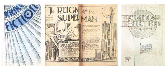
|
|
|
|
|
Joined: Sep 2001
Posts: 25,005 Likes: 29
brutally Kamphausened 15000+ posts
|
|
OP
brutally Kamphausened 15000+ posts
Joined: Sep 2001
Posts: 25,005 Likes: 29 |
Another Barry Windsor-Smith page from the late 1970's, that if I recall correctly was originally the cover sleeve for Smith's "Conan Tuppeny portfolio" (1974)Sourced from Steranko's MEDIASCENE 33 (Sept-Oct 1978), a special all-poster issue where it was reproduced in its original 11" X 17" size.  I had the good sense to make a good copy of it on heavy stock paper in 1998, and it still sits matted and framed on my wall, where I've enjoyed it for many years. TUPENNY PORTFOLIO (1974) b & w, as originally publishedTUPPENNY PORTFOLIO (1974) hand-colored versionSmith's Gorblimey Press was one of the major developments that came out of Marvel's CONAN titles, that developed a more sophisticated fan market in the mid/late 1970's. Ads for Smith's various prints and portfolios were advertised in most issues of SAVAGE SWORD OF CONAN of that era. And in Steranko's MEDIASCENE and PREVUE issues. From Steranko's opening editorial to MEDIASCENE 33, introducing his all-poster issue:
I'm pleased to have generated the original idea.
But I'm even more pleased to be one of the brotherhood who can create the kind of work represented in this issue --and to be in a position whereby the material can be packaged with skill and taste, and offered to a discriminating audience.
For which the rest of us are eternally grateful. It must be satisfying indeed to be part of that brotherhood.
|
|
|
|
|
Joined: Sep 2001
Posts: 25,005 Likes: 29
brutally Kamphausened 15000+ posts
|
|
OP
brutally Kamphausened 15000+ posts
Joined: Sep 2001
Posts: 25,005 Likes: 29 |
A couple more S&S series come to mind.
DAX THE WARRIOR was in EERIE magazine. The stories are no great shakes, but the art was my introduction to the incredible ESTEBAN MAROTO, who drew the sexiest women I had ever seen at that tender young age. Maroto did a ton of work for Warren, but precious few VAMPI episodes (which I always thought was odd). Among his more recent work has been THE ATLANTIS CHRONICLES, ZATANNA: COME TOGETHER and the tragically unfinished LADY RAWHIDE: OTHER PEOPLE'S BLOOD, which has the sad distinction of being cancelled in mid-story-- TWICE!! (Why don't they just issue a complete graphic novel and be done with it???)
I love Estaban Maroto's art, but haven't seen these particular stories. A blog credits the Dax storyline as running in EERIE magazine issues 39-52 (April 1972- Nov 1973). 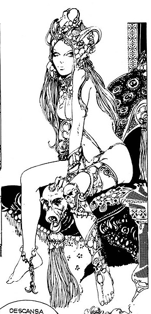 I loved a Maroto "Red Sonja" story that appeared in black-and-white in SAVAGE SWORD OF CONAN magazine 1, and reprinted in color in MARVEL FEATURE 1, followed by Bruce Jones and Frank Thorne's new series in issues 2-7. Even inked by Neal Adams, that Maroto/Adams story in issue 1 remained distinctively Maroto. And it would have been nice if Maroto had done a few Conan stories in SAVAGE SWORD OF CONAN. His art would have blended well with that of the regular Buscema/Alcala team. And a semi-pornographic version of Red Sonja (also by Thorne) later ran (1981-1983) in the Warren sci-fi magazine 1984/1994 (beginning in issue 7). (If Dr. Sigmund Freud were alive in modern times, I think Warren's 1984/1994 magazine would be his favorite series. Maybe along with HEAVY METAL, Richard Corben's DEN, and anything by Milo Manara or Bruce Jones.) In Dave Sim's CEREBUS issue 19, he teamed apocryphal versions of Red Sonja and Ghita in a story together, where the two faced off against each other.
|
|
|
|
|
Joined: Sep 2001
Posts: 25,005 Likes: 29
brutally Kamphausened 15000+ posts
|
|
OP
brutally Kamphausened 15000+ posts
Joined: Sep 2001
Posts: 25,005 Likes: 29 |
Another artist whose work I really love from the Warren magazines is Gonzalo Mayo. I'd especially recommend EERIE 66 (an all-Mayo issue, of "El Cid" stories, recently reprinted by Dark Horse in hardcover.) 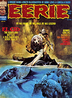 
|
|
|
|
|
Joined: Sep 2001
Posts: 25,005 Likes: 29
brutally Kamphausened 15000+ posts
|
|
OP
brutally Kamphausened 15000+ posts
Joined: Sep 2001
Posts: 25,005 Likes: 29 |
Several beautiful poster images from the 1970's and early 80's, including this one I never knew was a poster: 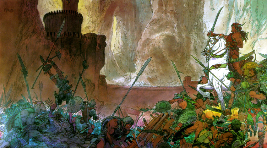 Which was also the wraparound cover (by Kaluta) of Marvel's comic book size OFFICIAL HANDBOOK TO THE CONAN UNIVERSE one-shot.
|
|
|
|
|
Joined: Sep 2001
Posts: 25,005 Likes: 29
brutally Kamphausened 15000+ posts
|
|
OP
brutally Kamphausened 15000+ posts
Joined: Sep 2001
Posts: 25,005 Likes: 29 |
Kaluta has done some fantastic Conan work. In particular this KING CONAN cover, that I have the 22" X 32" promotional poster for, that has been on my wall since 1983, in a size where you can really appreciate it.  I often see the promo poster for sale on ebay, if you want one.
|
|
|
|
|
Joined: Sep 2001
Posts: 25,005 Likes: 29
brutally Kamphausened 15000+ posts
|
|
OP
brutally Kamphausened 15000+ posts
Joined: Sep 2001
Posts: 25,005 Likes: 29 |
One of my favorite Windsor-Smith pieces, "Lord of the Black Corsairs".  Also printed in 1975 as the back cover of Marvel Treasury Edition 4, June 1975. That first collected Thomas/Smith's "Red Nails" Howard adaptation. Here it is with the original colors, as it appeared on the back cover of the treasury edition. I prefer the original colors.
|
|
|
|
|
Joined: Sep 2001
Posts: 25,005 Likes: 29
brutally Kamphausened 15000+ posts
|
|
OP
brutally Kamphausened 15000+ posts
Joined: Sep 2001
Posts: 25,005 Likes: 29 |
Actually, if you want to read Windsor-Smith's "Red Nails" adaptation, this edition, ROBERT E. HOWARD'S CONAN THE BARBARIAN #1 (and only) is a far nicer reprinting of it in 1983. The previous 1975 treasury edition for some reason shaves off part of the bottom of every page, presumably to make it fit the page-size dimensions of the treasury edition format. Dark Horse has also more recently reprinted these issues in trade and hardcover, but with awful re-coloring. I also love this title page from the story:  In a time when comics were aspiring toward a standard of book illustration and fine art. As opposed to the fanboy wankery that comics have descended into.
|
|
|
|
|
Joined: Sep 2001
Posts: 25,005 Likes: 29
brutally Kamphausened 15000+ posts
|
|
OP
brutally Kamphausened 15000+ posts
Joined: Sep 2001
Posts: 25,005 Likes: 29 |
A nice, and very early, Paul Smith pin-up from KING CONAN 9, done in 1980.  Note the boobies in the original black-and-white, censored and covered in the printed color version. Regardless, it helped Paul Smith make an early sale that led to a worthy career in the comics field. And here's the safe-for-the-kids printed version, in color.
|
|
|
|
|
Joined: Sep 2001
Posts: 25,005 Likes: 29
brutally Kamphausened 15000+ posts
|
|
OP
brutally Kamphausened 15000+ posts
Joined: Sep 2001
Posts: 25,005 Likes: 29 |
And another from KING CONAN 7, Sept 1981. http://www.paulmartinsmith.com/content/conan-and-frost-giants-daughter-pin-0These apparently helped Smith break into comics, after crossing paths with Roy Thomas. And after the girls in his pin-ups grew bikini tops.
|
|
|
|
|
Joined: Sep 2001
Posts: 25,005 Likes: 29
brutally Kamphausened 15000+ posts
|
|
OP
brutally Kamphausened 15000+ posts
Joined: Sep 2001
Posts: 25,005 Likes: 29 |
 This Windsor-Smith tribute page to Robert E. Howard (from the SAVAGE TALES "Red Nails" adaptation issues, and subsequent reprint editions) is another sophisticated manifestation of the literary aspirations of Thomas and Smith's work on the series. Beautiful stuff. And pioneering breakthrough work that lit the way for others.
|
|
|
|
|
Joined: Sep 2001
Posts: 25,005 Likes: 29
brutally Kamphausened 15000+ posts
|
|
OP
brutally Kamphausened 15000+ posts
Joined: Sep 2001
Posts: 25,005 Likes: 29 |
Wow!  http://capnscomics.blogspot.com/2013/08/belit-queen-of-black-coast-by-barry.html http://capnscomics.blogspot.com/2013/08/belit-queen-of-black-coast-by-barry.htmlAn unpublished Gorblimey Press print of Belit (a female pirate character romantically linked to Conan in CONAN THE BARBARIAN issues 58 (Jan 1976) - 100 (July 1979). Hard to imagine why it wasn't published. The other 5 pages are from Barry Smith's 1975 "Robert E. Howard portfolio", of Conan, Valeria, Solomon Kane, Thoth Amon, and Bran Mak Morn.
|
|
|
|
|
Joined: Sep 2001
Posts: 25,005 Likes: 29
brutally Kamphausened 15000+ posts
|
|
OP
brutally Kamphausened 15000+ posts
Joined: Sep 2001
Posts: 25,005 Likes: 29 |
 A captionless version of Smith's cover for CONAN ANNUAL 1.  And the original cluttered over-captioned version. I posted a black-and-white version that makes the clutter less noticeable.
|
|
|
|
|
Joined: Sep 2001
Posts: 25,005 Likes: 29
brutally Kamphausened 15000+ posts
|
|
OP
brutally Kamphausened 15000+ posts
Joined: Sep 2001
Posts: 25,005 Likes: 29 |
Two guys named Fastner and Larson back in the 1979-1981 period did a lot of portfolios for SQ Productions (Sal Quartuccio, out of New Jersey). They are probably most famous for their Spiderman Portfolio, Hulk Portfolio and X-Men Portfolio releases in that period. Which were advertised in all the Marvel magazines and fan publications of the time Here's a link to their site, with images and blog entries going back to early 2004: http://www.fastnerandlarson.com/fandl_images/hotstufcvr_sm.jpgWith many images going back all the way to their first work (that I'm aware of) doing a cover for SQ's underground anthology HOT STUF' issue 6 (Winter 1977). 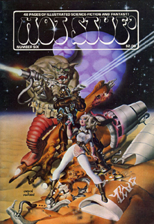
|
|
|
|
|
Joined: Sep 2001
Posts: 25,005 Likes: 29
brutally Kamphausened 15000+ posts
|
|
OP
brutally Kamphausened 15000+ posts
Joined: Sep 2001
Posts: 25,005 Likes: 29 |
I first saw a page of theirs in the Overstreet Price Guide No. 11 (1981), accompanying an ad for Graphitti. Only thanks to the magic of the internet do I finally now know the title of that "Heads Up" limited edition print, and its origins in Sept 1979. 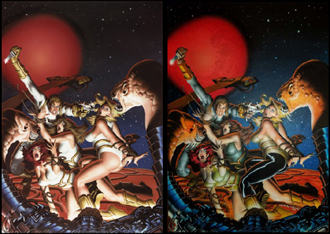 The self-deprecating humor of their posts are fun to read.
|
|
|
|
|
Joined: Sep 2001
Posts: 25,005 Likes: 29
brutally Kamphausened 15000+ posts
|
|
OP
brutally Kamphausened 15000+ posts
Joined: Sep 2001
Posts: 25,005 Likes: 29 |
Over the last few days, I've read the only recently published Conan story that I thought was consistent with the 70's/80's Marvel material: CONAN THE SLAYER (11 issues) https://comiconlinefree.com/conan-the-slayer/issue-1You could nit-pick, the artist isn't Windsor-Smith or Buscema or Starlin or Kayanan, but it's still a good story with nice art, on a par with Marvel's CONAN run.
|
|
|
|
|
Joined: Sep 2001
Posts: 25,005 Likes: 29
brutally Kamphausened 15000+ posts
|
|
OP
brutally Kamphausened 15000+ posts
Joined: Sep 2001
Posts: 25,005 Likes: 29 |
 I've come to realize over the last 2 or 3 years what an enormous contribution to the comics field amateur fanzines injected into the field in the 1960's and 1970's. The sophisticated sci-fi/pulp style design of these fanzines, the articles, the character histories, and the beautiful covers and artist portfolios, were something that carried over into magazines like SAVAGE TALES and SAVAGE SWORD OF CONAN. The first and best for a long time was ROCKETS BLAST COMIC COLLECTORhttps://www.mycomicshop.com/search?tid=448361&pgi=51The covers alone are worth the price of admission. You can see them evolve from very amateur efforts in the first 50 issues, into an 8" X 11" magazine on cardstock paper, with covers that presented many fans that later turned pro, such as Don Newton, Richard Corben, Bill Black, Robert Kline, John Adkins Richardson, Mike Zeck, Kerry Gammill, Butch Guice, Ron Wilbur, science fiction illustrator Stephen Fabian, and others. Along with very talented amateurs like Jerry Fantuccio. Along with occaasional offerings by old pros like Gil Kane, Wallace Wood (who also did the fanzine WITZEND), Tom Sutton, and CC Beck.
|
|
|
|
|
Joined: Sep 2001
Posts: 25,005 Likes: 29
brutally Kamphausened 15000+ posts
|
|
OP
brutally Kamphausened 15000+ posts
Joined: Sep 2001
Posts: 25,005 Likes: 29 |
I just stumbled on this Twitter blog page that shows a lot of great book illustrators, as well as artists like Berni Wrightson and Jim Steranko, that bridge the fields of comics illustation, book illustration, and fine art. https://twitter.com/thetzvortexI never cease to be awed by pages like these. With the benefit here of also presenting a window to authors and artists I've either never seen before, or works that I haven't seen in a long time, such as writer Algernon Blackwood.
|
|
|
|
|
Joined: Sep 2001
Posts: 25,005 Likes: 29
brutally Kamphausened 15000+ posts
|
|
OP
brutally Kamphausened 15000+ posts
Joined: Sep 2001
Posts: 25,005 Likes: 29 |
. ![[Linked Image from 1.bp.blogspot.com]](https://1.bp.blogspot.com/_L5fa2CwoCuY/S42b8f6YP9I/AAAAAAAABE4/gxVM2hSJ25E/w1200-h630-p-k-nu/TMT01.jpg) Here are all the covers for THE MONSTER TIMES. https://monstermagazinegalleries.blogspot.com/2010/03/monster-times.htmlhttps://www.mycomicshop.com/search?TID=628621https://www.mycomicshop.com/search?TID=22070625https://www.mycomicshop.com/search?TID=22011629 A newspaper that ran from 1972-1976 for 48 issues (plus 3 special issues), a really fun competitor of FAMOUS MONSTERS, but also in some ways a competitor with Steranko's MEDIASCENE paper, in covering comics, as well as sci-fi and horror books, television and movies. Including STERANKO'S HISTORY OF COMICS, vols 1 and 2 ! With some dynamite covers and interior art by Gray Morrow, Neal Adams and others. It's a great time capsule of sf, horror and comics of the period. With nice design, comparable to the 1970's Warren magazines.
|
|
|
|
|
Joined: Sep 2001
Posts: 25,005 Likes: 29
brutally Kamphausened 15000+ posts
|
|
OP
brutally Kamphausened 15000+ posts
Joined: Sep 2001
Posts: 25,005 Likes: 29 |
. Jim Steranko's MEDIASCENE was both a comics fanzine, an advance preview of film and television releases, as well as an aesthetically pleasing and constantly evolving display of art and design, semi-regularly published from roughly 1972 to 1994. ![[Linked Image from i0.wp.com]](https://i0.wp.com/comicbookinvest.com/wp-content/uploads/2016/05/image12.jpg) The first 6 issues were COMIXSCENE from 1972-1973, in 11" X 17" newspaper format, in 2 sections, initially totalling 24 to 36 pages. https://www.mycomicshop.com/search?TID=19126902![[Linked Image from i.pinimg.com]](https://i.pinimg.com/474x/a9/1d/42/a91d429fe7bd97219dc31bb90a6ff531--jim-steranko-shadow-of.jpg) ![[Linked Image from 1.bp.blogspot.com]](https://1.bp.blogspot.com/-pEEM6sa0Stw/Uf8-oH7gjqI/AAAAAAAARjU/MpTuFR4bKHM/s640/MS+BG2.jpg) ![[Linked Image from i.pinimg.com]](https://i.pinimg.com/736x/ca/9b/85/ca9b8513497a2513454f3cce1c69af70--jim-steranko-jim-orourke.jpg) The title changed to MEDIASCENE for issues 7-40, from Dec 1973- Dec 1979, continuing in an 11 X 17" newspaper format, with a greater focus on mainstream media, but still covering comics. Many of the covers by Steranko, Corben, Adams and others, could double as movie posters. With 2 great all-pin-up issues in 33 and 40. https://www.mycomicshop.com/search?TID=21056117![[Linked Image from i.pinimg.com]](https://i.pinimg.com/originals/c2/5e/06/c25e06f076c7953b71bf2132d6c8dd21.png) With issues 41-47 the title changed to PREVUE, July 1980- May 1982, upgrading to a magazine format in a 9" X 12" size, and a further development in design. And increasingly focused on movies, actors and interviews. https://www.mycomicshop.com/search?TID=171941From issue 48 untill the end of its run in issue 92, 1982-1994, it kept the same PREVUE title, but moved to a standard 8 X 11" format, with glossy paper and an increasing ratio of color material. The last 2 issues' covers each have new logos, that make it look like yet another new magazine. ![[Linked Image from 2.bp.blogspot.com]](https://2.bp.blogspot.com/_H2rDl9tVdag/TPwpj1RerwI/AAAAAAAADVw/WBwDzI9unyk/s1600/historyofcomics01.jpg) Add to this his famous STERANKO'S HISTORY OF COMICS, volumes 1 and 2 (1970 and 1972). Which I've savored for over 40 years now. HISTORY OF COMICS vol 1 focuses on the pulp magazines and newspaper strips such as by Hal Foster and Alex Raymond, from which the comics industry spawned, and the evolution from there to Superman, Batman and the Golden Age of comics from 1938-1945. HISTORY OF COMICS vol 2 focuses more on the Golden Age superheroes and Fawcett and Quality comics titles. It was projected on the intro pages of both volumes that the series would eventually expand to 6 volumes, roughly covering pre-Code era, post-Code Silver Age 1950's , 1960's and 1970's eras. I wish if Steranko lost interest in concluding this HISTORY OF COMICS series, he'd at least subcontracted it to other writers and overseen its conclusion. But regardless, these two volumes are wonderful to have. https://www.mycomicshop.com/search?TID=482701Steranko also did a SUPERGIRLS pin-up calendar, that I've gotten several pages of, but not the complete calendar. While nice, I just didn't feel it's worth spending what it sells for now: https://www.mycomicshop.com/search?TID=45027032https://i.pinimg.com/originals/fd/7a/80/fd7a80112e2ecf72e8991a2701ff4729.jpgHere are the other publications from Steranko's company, Supergraphics: https://www.mycomicshop.com/search?pl=SupergraphicsI had some of these Supergraphics things for many years, such as the CARTOONISTS AND ARTISTS PORTFOLIO issues, the Steranko collector box, the TALON and STAR TREK posters, as well as the poster versions of Steranko's HISTORY OF COMICS, not realizing that these were published by Supergraphics. The RAIDERS OF THE LOST ARK painted posters by Steranko were later re-published in EPIC ILLUSTRATED 19, in 1983. http://www.thedrawingsofsteranko.com/raiders.htmlAnother special Steranko issue not published by Supergraphics, I also love the comic-size TALES FROM THE EDGE # 11 (a k a, on the cover: STERANKO: GRAPHIC PRINCE OF DARKNESS) published in 1998, with an overview of Steranko's life and career, with a lot of work I hadn't previously seen. Edited and published by David Spurlock, but clearly with publication design by Steranko. https://www.mycomicshop.com/search?TID=156311Another of my favorites is Steranko's work in THE ILLUSTRATED HARLAN ELLISON (1978), in tpb and hardcover editions, by Byron Preiss. With a 10-page illustrated version of Ellison's " 'Repent, Harlequin', said the Ticktockman" story. https://www.mycomicshop.com/search?q=illustrated+harlan&pubid=&PubRng= And also a signed/numbered black-and-white portfolio version, signed by both Steranko and Ellison. https://www.mycomicshop.com/search?TID=29617568![[Linked Image from 3.bp.blogspot.com]](http://3.bp.blogspot.com/-JR5ZAmvSscQ/Uuaq6V1t3AI/AAAAAAAAOug/HiPZY2_VeTc/s320/Jim+steranko__Harlan+Ellison+-+Repent_Harlequin_00.jpg) http://www.thedrawingsofsteranko.com/REPENT/repent_article_.htmlhttp://www.thedrawingsofsteranko.com/aghp.html http://www.thedrawingsofsteranko.com/REPENT/repent_article_.htmlhttp://www.thedrawingsofsteranko.com/aghp.html
|
|
|
|
|
Joined: Sep 2001
Posts: 25,005 Likes: 29
brutally Kamphausened 15000+ posts
|
|
OP
brutally Kamphausened 15000+ posts
Joined: Sep 2001
Posts: 25,005 Likes: 29 |
I first saw a page of theirs in the Overstreet Price Guide No. 11 (1981), accompanying an ad for Graphitti. Only thanks to the magic of the internet do I finally now know the title of that "Heads Up" limited edition print, and its origins in Sept 1979. http://www.fastnerandlarson.com/fandl_images/heads_up_retouch_lg.jpgThe self-deprecating humor of their posts are fun to read. They slightly altered their site, here's an updated link : http://www.fastnerandlarson.com/news.html
|
|
|
|
|
Joined: Sep 2001
Posts: 25,005 Likes: 29
brutally Kamphausened 15000+ posts
|
|
OP
brutally Kamphausened 15000+ posts
Joined: Sep 2001
Posts: 25,005 Likes: 29 |
I first saw a page of theirs in the Overstreet Price Guide No. 11 (1981), accompanying an ad for Graphitti. Only thanks to the magic of the internet do I finally now know the title of that "Heads Up" limited edition print, and its origins in Sept 1979. ![[Linked Image from media.mutualart.com]](https://media.mutualart.com/Images/2018_10/02/10/103231118/989b87d9-5cfb-49e4-9389-8472b9c81e8e_570.Jpeg) The self-deprecating humor of their posts are fun to read. Updated with a working image link. This was my introduction to Fastner and Larsen's work, from an ad in Overstreet Guide 11. I still like their 1977-1982 work the best. Here's a larger version of the same image, where you can see the detail.
|
|
|
|
|
Joined: Sep 2001
Posts: 25,005 Likes: 29
brutally Kamphausened 15000+ posts
|
|
OP
brutally Kamphausened 15000+ posts
Joined: Sep 2001
Posts: 25,005 Likes: 29 |
. ![[Linked Image from i.pinimg.com]](https://i.pinimg.com/474x/1f/48/83/1f48831e368d0441ac02b5dcd780eb8d.jpg) Another I like from Fastner/Larsen's X-MEN PORTFOLIO. 2 of the 4 prints in this set were Fastner/Larson painted art over Byrne layouts. The other 2 are Fastner/Larson only.
|
|
|
|
|
Joined: Sep 2001
Posts: 25,005 Likes: 29
brutally Kamphausened 15000+ posts
|
|
OP
brutally Kamphausened 15000+ posts
Joined: Sep 2001
Posts: 25,005 Likes: 29 |
|
|
|
|
|
Joined: Sep 2001
Posts: 25,005 Likes: 29
brutally Kamphausened 15000+ posts
|
|
OP
brutally Kamphausened 15000+ posts
Joined: Sep 2001
Posts: 25,005 Likes: 29 |
. More Lela Dowling. I haven't seen work by her in comics or portfolios or prints since the early 1990's. But she was big and influential with her Unicorns and Dragons portfolios (both in black and white). Followed by Dragons II and Unicorns II portfolios, in color. All gorgeous work, from about 1979-1983. Part of the large new market of limited portfolios that evolved out of the SAVAGE SWORD OF CONAN portfolio sections into (for a while) a prolific portfolio market from about 1974-1983, and Dowling's were some of the most popular of that era. Here's a Dowling page from her Unicorns II portfolio : ![[Linked Image from i.pinimg.com]](https://i.pinimg.com/originals/b2/20/db/b220dbf289bc7dac8fee33d2219c4140.jpg) And here's a separate black and white print she did, "Flights of Fancy", separate from the above portfolios, another I think is one of her nicer pages, that I'm glad to have in my collection. ![[Linked Image from i.pinimg.com]](https://i.pinimg.com/originals/06/65/14/066514d1f5d4c91e02c21767a379ddc5.jpg)
|
|
|
|
|

![[Linked Image from i.pinimg.com]](https://i.pinimg.com/originals/61/0d/2a/610d2ac1b6bb6fa62da9a6e7e0e4c3c0.jpg)
![[Linked Image from i.pinimg.com]](https://i.pinimg.com/originals/f1/68/a3/f168a3ef8a033fc3f108ef338a2b44a3.jpg)
![[Linked Image from i.pinimg.com]](https://i.pinimg.com/originals/21/95/72/21957259b68758821b8c26aea5c80e0c.jpg)